Mobile UI and Game Design: Screens vs. Flows
Context:
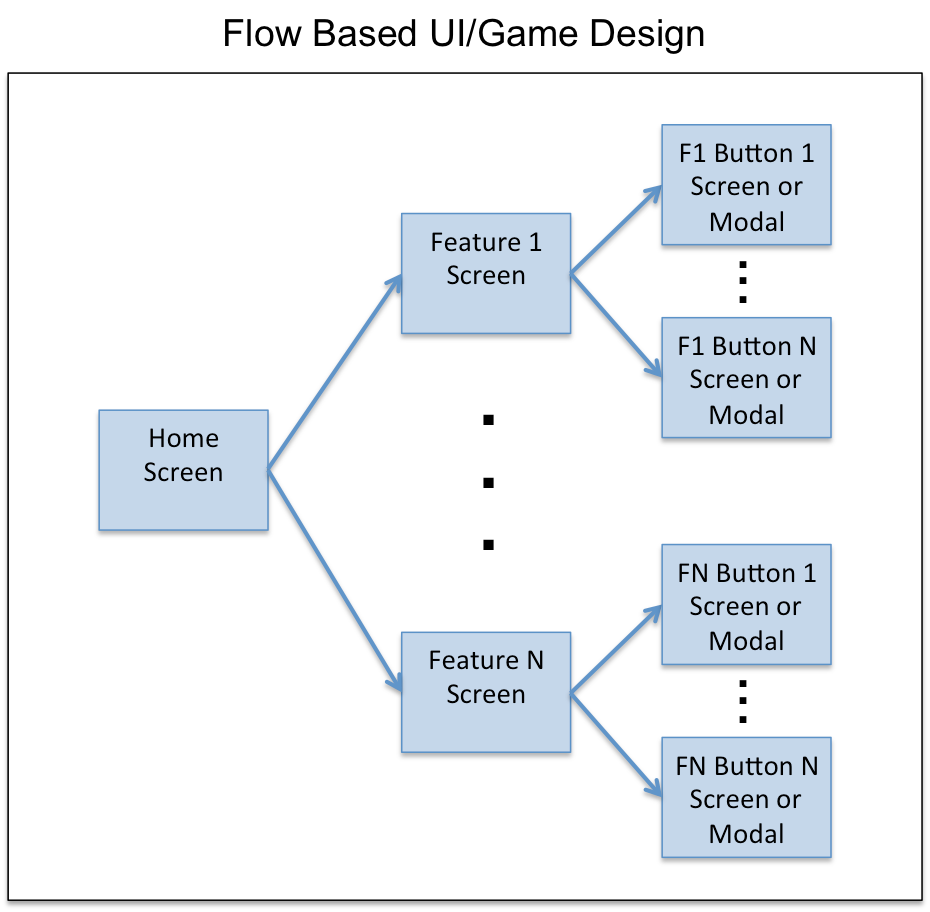
Mobile game design by flows refers to the concept of mapping out the entire set of screens a user can tap through in a mobile game: the user flows. While many of the larger mobile game studios such as Zynga or GREE routinely design UI/UX by flows, many mobile application designers are still designing individual screens by feature.
In this blog post I describe:
Screens vs. Flows Concept: The concept of designing screens vs. flows and why flows are critical in mobile game design
Preferred Approach: A format and tool (using Google Docs Drawings) that I believe is superior to existing approaches found in many of the studios today
1. Screens vs. Flows
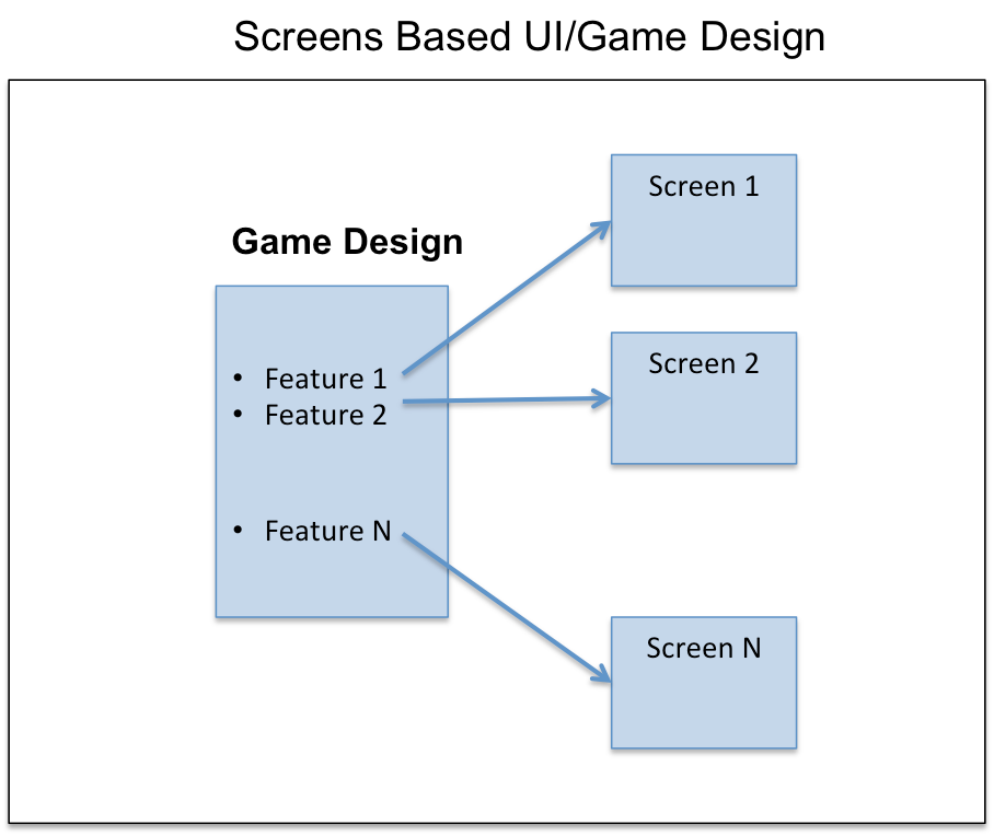
In the past few years, having had the opportunity to work with and collaborate with a number of different game designers I've noticed that many designers are still designing mobile games via Screens. What do I mean by this?
A typical process I see is to initially start with a game design document that lists a set of features that comprise the game. After that, the features are broken down and then a game screen for each feature is designed by game designers and UI artists. This approach seems generally true in small studios and especially with game designers coming from the console/PC space. Console/PC designers generally aren't used to a bunch of screens that is more typical within mobile applications. How many screens is a user presented with in the "core loop" of Call of Duty?

This is a very reductionist (vs. holistic) approach to game design. This ignores how users actually interact with the game and all of the paths, the user flows, that comprise the overall user experience.
A better approach is to design your mobile application considering the user's path within your game and how the user will actually traverse all of the screens.

Game and UI designers get 2 primary advantages from this approach:
User Experience Understanding: It becomes much easier to visualize and walk through just how a user will experience your mobile application
Avoiding Feature Explosion: By mapping all of the flows (and not stopping at the screen level) game designers don't become surprised with new features and contingencies they didn't expect
I can speak from personal experience in saying that there have been numerous occasions where not mapping out all of the flows has led to unforeseen contingencies and additional required functionality. The simple question: "What happens when someone taps on X?" for every single button and tappable icon will almost always reveal unforeseen functionality that will need to be supported.
In many cases, we may have estimated say a 10 day development schedule for feature X but then due to unforeseen functionality it turns out we now need to expand the schedule by another 5 days (for example). This is even further compounded when we also need art and additional UI which bottlenecks development.
A Flows based design approach will often lead to much more accurate estimates of development schedule.
2. Preferred Approach: Google Drawing -> Compact Overview
In my experience, designing application flows is typically handled in one of 2 ways:
Big Ass AI File: In this approach, a UI artist will (often using Adobe Illustrator) draw out the full set of screens and flows. The end result is a really large image with even up to 30+ screens in some cases with arrows and notes all over the place. It's also possible to breakdown by feature, but you typically still have a lot of screens and it's difficult to get more than a specific feature view in that case.
Compact Overview: Another approach is to just stick all of the screens in an ordered way e.g., 3-4 screens across on a website or JPG. This approach gives a very compact way of viewing the screens and a general sense of flow.
Both of these approaches, however, suffer from some major disadvantages as follows:
Big Ass AI File:
Too difficult to easily see what's going on with such a big ass picture. It's easy to get lost in the details of a really big image.
Compact Overview:
In website form, lacks notes and arrows for flows
Both Methods:
Lack of individual and group security
Inability to share and collaborate and give access to multiple users who can work on the flows document simultaneously
Very difficult to add and share comments
No version control with revision history
Lack of other key features such as easy editing/image insertion, copying, etc.
So what is a better solution?
Well much of what I describe above comes built in with Google Docs! Hence, we can just adopt a variation of the 3 column compact overview method using a Google Docs Drawing format but add notes and arrows, enable collaboration, and use all of the nifty features built in by Google.
Let me show you a simple example from a partial game design I worked on for fun last year (Click View->100% for better viewing):
In this solution:
Tool: Go to Google Docs and create a Google Docs Drawing
Click File->Page Setup and change the width to about 12" and the length according to how many screens you will design
Click View->100%
Click View->Snap To->Grid (I find it easier to align my wires this way to the grid boundaries)
Organization: Organize your screens 3 screens across (hence each screen should take up slightly less than 4" width)
Drag and Drop: Take any wires or final screens and just drag and drop them into place
Notes and Arrows: Add notes and screen titles as appropriate. Use arrows to show where buttons should lead or screens should flow
Placeholders: Map every flow with the necessary screens and just put placeholder screens where you haven't designed that screen yet. Keep everything up to date!
Security and Collaboration: Set your security permissions and share with the other folks who should be able to collaborate with you. You can leave notes here as well.
Overall Approach:
Google Drawing: During the initial game design, create a Google Drawing with all of the flows in rough black & white mocks
Iterate Core Design: Iterate with your design team on all of the major flows until the core design is settled upon. Here the iteration process will be much easier with the collaboration and easy editing capabilities of Google Drawing
Shift to Compact Overview: Once the core design is complete you will now be adding incremental features and design iteration as appropriate. To keep a very easy overview of the whole game in mind create a Compact Overview mocks website with all of the latest screens or mocks always updated in real time.
You'll lose notes/review/comments at a macro level but at this point you should be doing that at the specific feature or iteration level
For new features depending on the complexity and size of the feature, you could do a feature specific flows document using Google Drawing and add to the Compact Overview when ready
That's it. If you know of a better solution please reach out and comment below...

