Why Your Mobile Game Failed: Complexity Kills!
One of the most difficult problems in designing any game is how to address complexity in the game design.
For mobile gaming in particular, this is a difficult problem as the design paradigms of successful complexity models have largely been figured out on other platforms (e.g., social, console, PC, and even game focused handheld) but not quite yet on mobile (if we define mobile to be specific to mobile phones at least). The newness of the phone platform makes this an especially challenging problem and one in which we've seen many industry mistakes occur time and time again (including from yours truly).
How difficult can it be to design complexity for what amounts to a smaller screen and limited controls?
In fact, very difficult.
For mobile games, I think of complexity as broken down into the following primary components:
User Interface
User Flows
Controls
Gameplay
Resource
Loops/Mechanics
If we think of some of the most successful games on mobile phones today we have seen an emerging pattern of simplicity trump complexity time and time again.
Successful Complexity Patterns in Mobile Games:
[table id=12 /]
On the other side, we have seen complex designs fail to resonate with users time and time again.
So What?
My point is that you should think more critically of your game design with respect to complexity. Further, two sets of recommendations based on this:
#1. Complexity Framework:
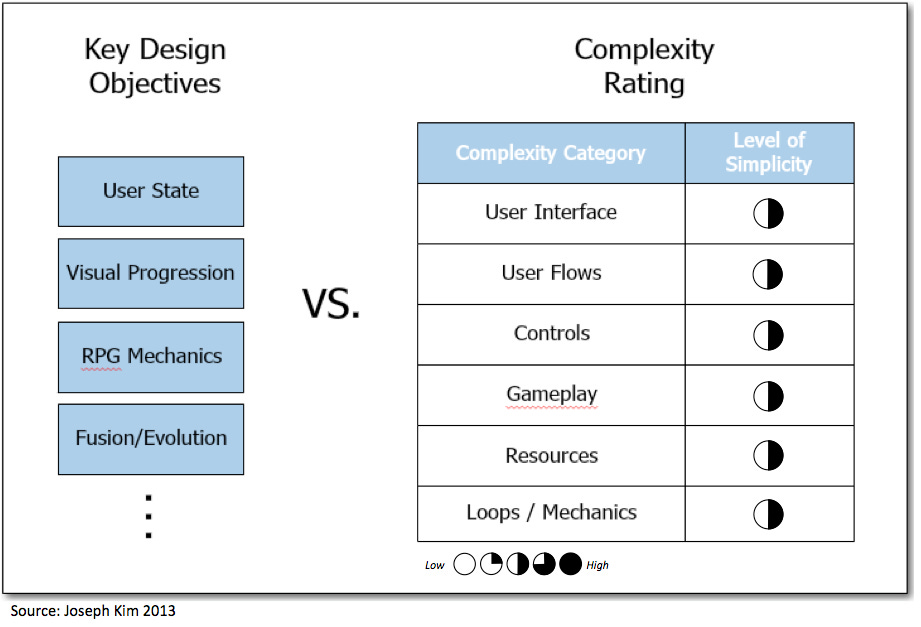
Understand what your key game design objectives are (or focus specifically on what your game's +1 design is) and how you can achieve those objectives with the minimal amount of complexity.
Design Objectives vs. Complexity:

Further, it's always helpful to review your application and check each category of complexity to think through whether you can additionally simplify or minimize.
#2. Target Complexity by Platform:
Make sure that the complexity design in your game is appropriate for the device the game will be launched on.
Complexity Matching:
As I showed in the Successful Complexity Patterns in Mobile Games table above, for mobile we are seeing very simple designs achieve critical success. Further, we see complexity design patterns too often shoot too high for mobile games. Again, sounding the broken record: complexity needs to be specifically designed for each platform.

Ok, I think you probably get the idea now but let's take a couple of very simple examples to illustrate how we would use this in practice.
Simple Example #1: Candy Crush Saga
Let's think about how the original designers may have thought about the game design:
Core gameplay mechanic:
Match-3
+1 Design Objectives:
Anipong Hearts: Monetization model that kicked ass on Kakao Talk
Visual Progression: Map with stateful progress for retention
Incremental Payment Model: Casual games typically made more money as paid, CC used hard gates for every chapter as an alternative to traditional Free and Paid models
Social Integration: To leverage their massive Facebook audience
Gameplay variation: Add different kinds of gameplay like dropping recipe items, timed levels, removing jellies, breakable obstacles, etc.
In the interest of time, I won't break down each design objective and complexity impact... but you can see in the game how they implemented each design objective and that overall they obviously did great:
None of the design objectives increased complexity across all complexity categories except for gameplay. In fact, they were even able to reduce complexity overall in areas while still achieving their design objectives.
For the Gameplay variation objective they introduced the new gameplay types slowly and explained them very well.
The only area where they missed was the explanation of various candy combinations and what they do and how they are represented.
Simple Example #2: Clash of Clans
Core gameplay mechanic:
Tower Defense (Backyard Monsters, Edgeworld)
+1 Design Objectives:
Simplify: Simplify gameplay and user interface for mobile devices
Broaden Appeal: Broaden audience appeal to be less hardcore
In this case, the whole point was to make a game just like Backyard Monsters and Edgeworld but make it accessible to users on mobile devices and to broaden the genre's appeal. This is an example where the whole point is to think in terms of complexity reduction. Supercell here also obviously did a great job and across all complexity categories were able to simplify UI, user flows, gameplay, etc.
Let's just take one specific example of just the HUD UI. Notice:
Fewer HUD elements, resources, and options available on Clash of Clans vs. Backyard Monsters and Edgeworld
Attention and flow directed to main core loop of PVP/PVE in Clash of Clans via Attack button which is highlighted and much bigger than other buttons
In general, how much easier it seems to be able to grasp what is going on and what to do in Clash of Clans
Backyard Monsters:

Edgeworld:

Clash of Clans:

Next Steps:
So in thinking about your game design do keep complexity in mind.
Further, think carefully about specific mechanics e.g., turn-based combat vs. single turn automated, amount of micro vs. macro, full control scheme vs. simple controls, lengthy story vs. quick story context, number of game resources, HUD elements, etc. etc.
Each of these should vary by platform in the general case.
Good luck!
Note: Thanks to Pawel Krawczynski for pointing out mistake in my Complexity by Platform diagram which is now fixed.

